


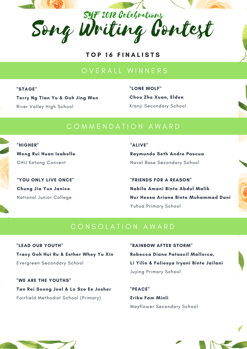
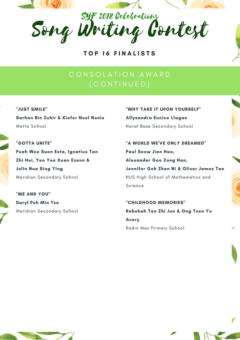
Results of SYF 2018 Logo Design & Song Writing Contest
Curious about the thought processes behind the artworks submitted for the TMDC? Scroll down to view the online exhibition of the winning motifs!
Also, do check back as we unveil songs from the Song Writing Contest in June 2018!
SYF 2018 SONG WRITING CONTEST
THEME MOTIF DESIGN CONTEST ONLINE EXHIBITION
| THEME MOTIF DESIGN | ARTIST STATEMENT |
|---|---|
|
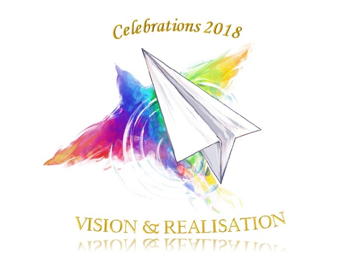
My logo design shows a gliding paper plane with a reflection of a bird flying upon the surface of water.
The paper plane represents vision, while the bird represents realisation. Having a vision is just a beginning of one's journey just like the paper plane which can only glide that far but realisation requires much thorough planning and lots of hard work to make everything happen. In this case it’s just like the bird which can bring us well beyond, towards the land of realization. My logo is a reflection of my own personal journey in my pursuit of passion and interest. |
|
ARTIST :
Wong Cze
Wei, Zovy
SCHOOL: New Town Secondary School |
» COMMENDATION AWARDS «
| THEME MOTIF DESIGN | ARTIST STATEMENT |
|---|---|
|
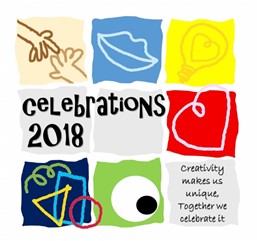
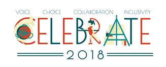
This logo is designed using iPad and PowerPoint. It is made up of colourful spaces of shapes and lines, with a meaning behind each of them. Light bulb – Ideas and Creativity Hands (touching each other) – Collaboration and Teamwork Mouth – Voice and Choice Heart – Passion and Feelings Shapes (different and overlapping) – Uniqueness and Inclusivity Eye – Appreciation for the Arts Vibrant colours and wavy lines are used to symbolise diversity and liveliness, which are what makes the youth in Singapore so special. Through my logo, I hope to bring across the message that Creativity makes us unique, Together we celebrate it. |
|
ARTIST :
Delphina
Tong She Hong
SCHOOL : Fairfield Methodist School (Primary) |
|
| THEME MOTIF DESIGN | ARTIST STATEMENT |
|
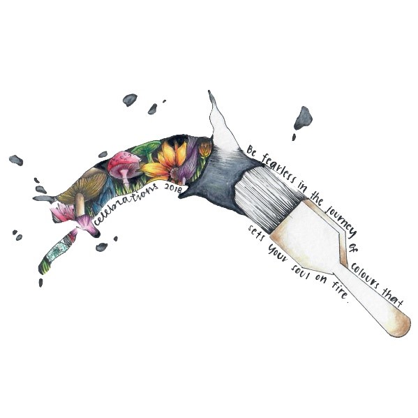
I used different types of mushrooms and flowers to represent the unique rage of arts. The mushrooms and flowers were arranged at the side of the pathway. The pathway represents the journey of art. Everyone have their own paint brush to paint their own art journey. Walking through this art journey is long as art does not end. Art is everywhere. Willing to hold the paint brush to paint your own choice of journey of art. Hence, unleash your talent. |
|
ARTIST:
Toh Pei Qi
SCHOOL: Orchid Park Secondary School |
|
| THEME MOTIF DESIGN | ARTIST STATEMENT |
|
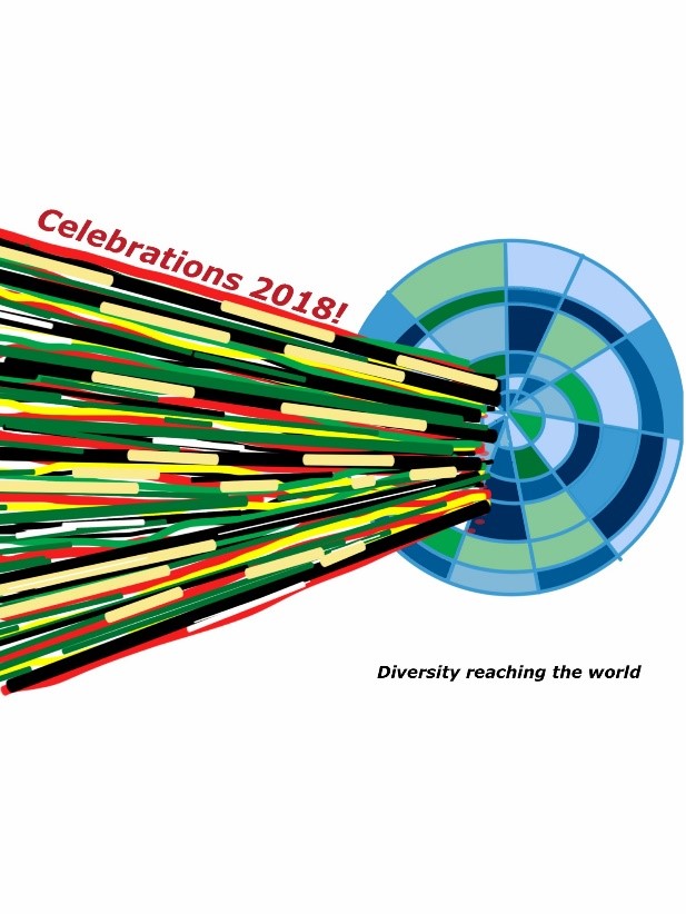
The colours are like bolts of light which represent the energy, diversity and speed of youth in Singapore. They go straight out to the world - represented here by the concentric circles - reaching out and catching up with the world |
|
ARTIST:
Alvin Zhuo Zhengyang
SCHOOL: Towner Gardens School |
|
| THEME MOTIF DESIGN | ARTIST STATEMENT |
|
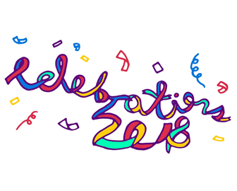
My logo depicts the vivid result of arts and celebrations. The simple use of only primary colours and green easily catch the viewers' eyes due to its vibrance and how joyful it looks, as well as show the harmony between the different arts and how it appears beautiful to the senses. The words "Celebrations 2018" are in the shape of a long confetti ribbon, with many other confetti ribbons to enhance the celebratory mood. I tried to experiment with the use of negative space in the confetti to energise the logo, while not distracting from the main element. |
|
ARTIST:
Elliot Tan Bing Ze
SCHOOL: Victoria School |
|
| THEME MOTIF DESIGN | ARTIST STATEMENT |
|
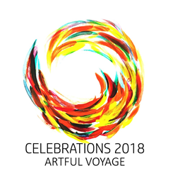
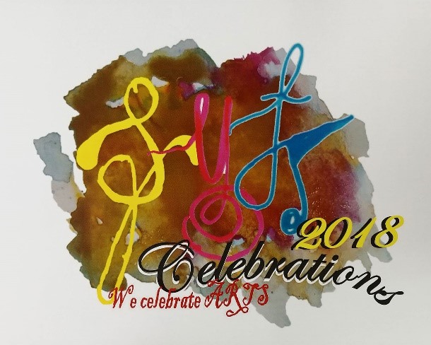
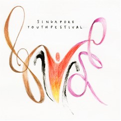
Presented in the form of a swirl with vivid and spontaneous brush strokes moving together, my artwork portrays a sense of dynamic rhythm and movement where the youthful individuals embark on a journey of self-discovery, expressions and creativity as a team. The motions conveyed through my artwork also suggest the Singapore Youth Festival (SYF) as a platform for constant reflections, questioning, learning process and the constant desire for betterment. So together, let’s celebrate this artful voyage with spirit, vigour, teamwork and vibrancy. |
|
ARTIST:
Jin Yi Chen
SCHOOL: Whitley Secondary School |
» CONSOLATION AWARDS «
| THEME MOTIF DESIGN | ARTIST STATEMENT |
|---|---|
|
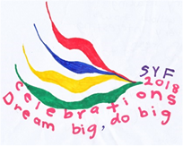
The four different ribbons represents the arts. The convergence of the ribbons represents the showcasing of the different talents coming together on one stage – SYF. It is a celebration of different talents coming together as one. The arts have allowed us to dream big and not be afraid to express ourselves. When we are on the stage performing for one and all to see, we remember our dreams and give it our best – do BIG…do our BEST. |
|
ARTIST:
Kayla Faith Ong
SCHOOL: CHIJ Primary (Toa Payoh) |
|
| THEME MOTIF DESIGN | ARTIST STATEMENT |
|
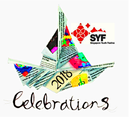
Over the years, the Arts in Singapore has grown tremendously from uncertain beginnings, like a fragile paper boat in choppy waters. As the Arts in Singapore continues growing on this vibrant journey, it is important that we celebrate how far the arts scene has come, while continuing to remain forward-looking. As for my logo design, I hope to represent the SYF journey through numerous articles and milestones, shaped into a paper boat as an embodiment of the idea of celebrating achievements yet continuing to move forward, ever steadfast as a sailboat. |
|
ARTIST:
Ho Sze Yuan
SCHOOL: Commonwealth Secondary School |
|
| THEME MOTIF DESIGN | ARTIST STATEMENT |
|
My SYF logo design has primary colours as the main colours as the arts are my primary interests in school and I am sure many youths are feeling the same too. The cursive letterings show movement and it is an important element in the field of music, dance and visual arts too. The letters are joined together to show that the Arts are for EVERYONE and no one should be excluded. The background brings all of us together as one as we immerse in the joy and excitement when we are engaging in the Arts in our schools. |
|
ARTIST:
Liang Chi Cheng
SCHOOL: East View Primary School |
|
| THEME MOTIF DESIGN | ARTIST STATEMENT |
|
To celebrate the achievement of youth in arts, I selected three types of arts-music, art and dance, which represent a diverse of art talent among students. i combined music, art and dance with typography. “C” resembles a French horn, while “R” resembles a dancing girl and “A” resembles an easel with canvas. Together with other letters, they create the line “celebrate 2018”. By making use of only five colors, I hope to achieve a flat yet vivid appearance that symbolizes the simplicity and vitality of the youth. The logo demonstrates the intention of design in a self-evident way. |
|
ARTIST:
Xu Yitian
SCHOOL: Hwa Chong Institution |
|
| THEME MOTIF DESIGN | ARTIST STATEMENT |
|
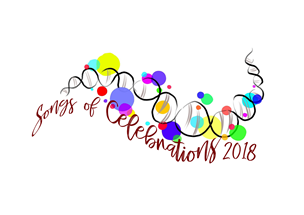
The logo is inspired by Kandinsky, an abstract expressionist artist. He uses lines and shapes to create the impression of depth and form, evoking deep emotions and thoughts through his pieces. This logo alludes to the shape that of a musical score. The coloured dots represent different personalities and expressions like the musical notes. A note on its own is solitary and characterless, but when arranged together, they compose a song of celebration. All the dots are connected by the DNA strand that celebrates uniqueness and diversity as one through the arts. |
|
ARTIST:
Seow Tze Jen, Jamie
SCHOOL: Methodist Girls’ School (Secondary) |
|
| THEME MOTIF DESIGN | ARTIST STATEMENT |
|
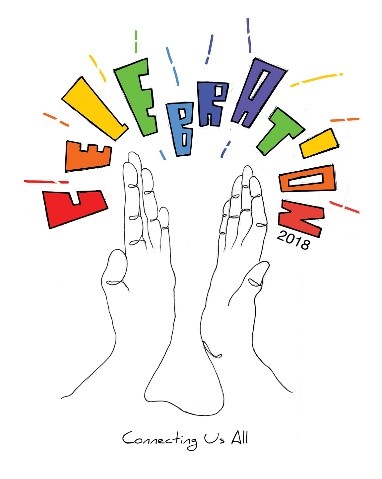
My artwork celebrates the joy of unification of youths. We all come from different backgrounds but art is the one that connects us all and therefore I decided to do a one line drawing of a hand clapping with different colours. The hands are coming together to applaud and show the joy of celebration therefore I decided to have the sound effects spell out celebration. I hope that this line continues to grow and connect more youths because art is truly for everyone and it brings happiness. |
|
ARTIST:
Chen Junyu Ryan
SCHOOL: Nanyang Junor College |
|
| THEME MOTIF DESIGN | ARTIST STATEMENT |
|
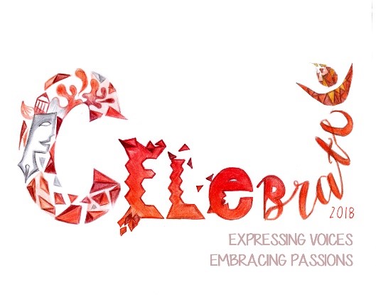
My design aims to depict art-making which is a process filled with many ideas and possible ways to execute. Thus, the world ‘celebrate’ changes its shapes and form. Even though there are many transformations and ideas, they all relate to one message which is represented by the consistent colour: red. Different shades show the different passions that every student might have towards creating or performing. This represents that all forms of expressions in arts require passion as well. |
|
ARTIST:
Fibbra Adilla Binte Ibrahim
SCHOOL: Naval Base Secondary School |
|
| THEME MOTIF DESIGN | ARTIST STATEMENT |
|
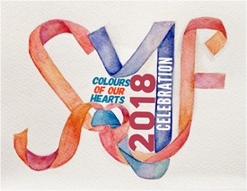
Youth are the main focus of 2018 celebrations. SYF stands for Singapore Youth Festival so the Y is coloured and emphasised. SYF in my logo is made from ribbons which is used during celebration. The ribbons are tightly interwoven and the Y tightly bounds S and F together. It shows how important our youth are. The different shades of colours represent our different shades of individuality and together we are one heARTs. Without youth, there will not be a future for Singapore or even the arts festival. |
|
ARTIST:
Joyce Hoon Xin Ru
SCHOOL: Ngee Ann Secondary School |
|
| THEME MOTIF DESIGN | ARTIST STATEMENT |
|
This logo represents all forms of art presented during SYF – visual arts and performing arts. There is a man connecting both the treble clef, the music aspect; and a ribbon, the dance aspect. The black brush strokes represents visual arts. It is through these arts that the man feels exuberant, glowing reddish orange – a colour representing passion. In the three main images are the letters S, Y and F, which stands for Singapore Youth Festival. |
|
ARTIST:
Amelia Ee En Qi
SCHOOL: St. Margaret’s Sec School |
|
| THEME MOTIF DESIGN | ARTIST STATEMENT |
|
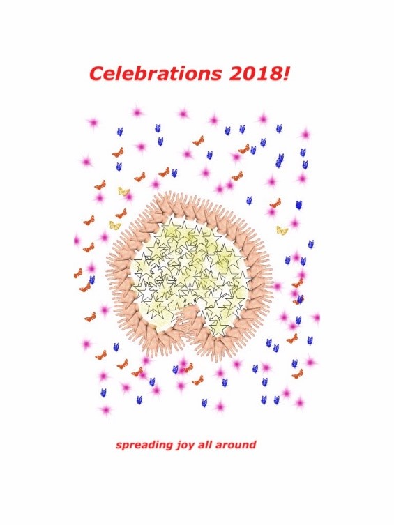
The artist is happy and she wants to spread her joy to everyone. The butterflies represent all kinds of people while the stars represent the happiness she can give whenever she touches the people she meet. |
|
ARTIST:
Iman Bte Ahmad Bashir
SCHOOL: Towner Gardens School |
SYF 2018 LOGO DESIGN MASTERCLASS
This specially curated MasterClass session in March 2018 broadened the finalists’ understanding of creative design practices through the designer’s sharing of his portfolio and creative design experiences. The finalists also had the rare opportunity to have their creative works reviewed by Jonathan, where they gained useful feedback to improve on their creative works. Everyone enjoyed the session very much!
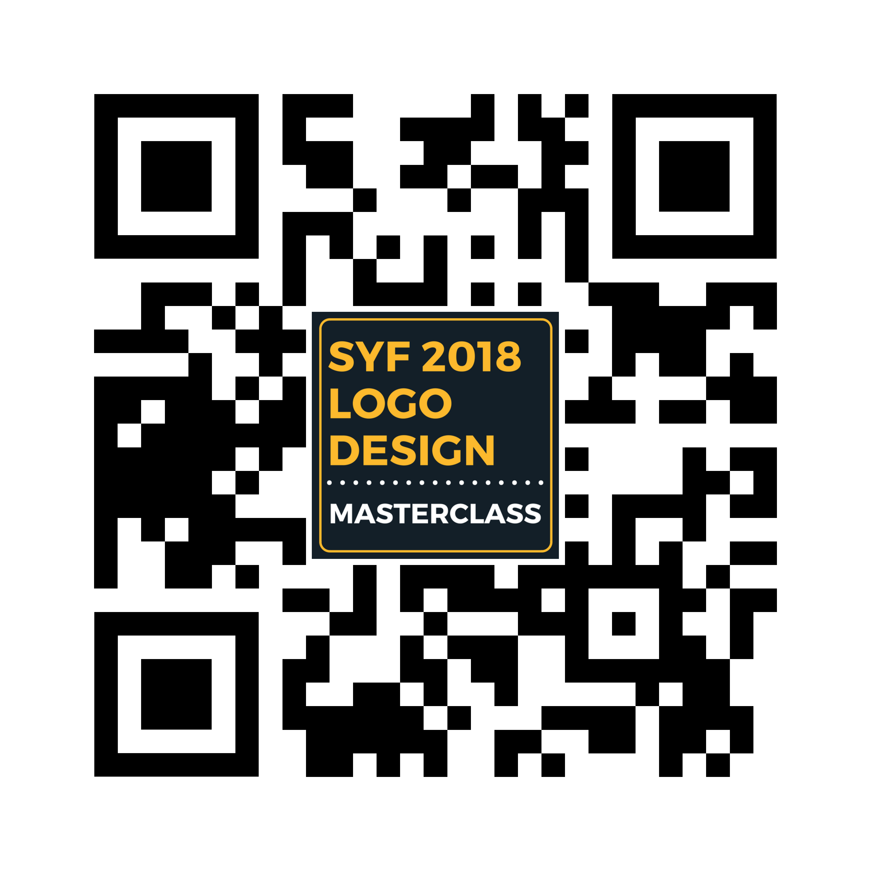
To see what the students have learnt from the Logo Design Masterclass, click on following link or scan the QR code on the left to watch the video.
Video: SYF 2018 Logo Design Masterclass

Copyright © Singapore Youth Festival
Last Updated :